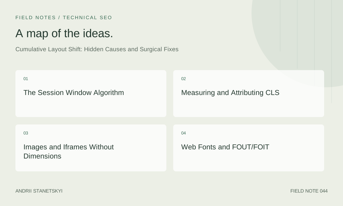
Cumulative Layout Shift (CLS) is the Core Web Vital that causes the most confusion in practice — not because the metric is complex, but because its causes are. A developer looking at clean HTML and no obvious content injection can still find CLS of 0.3 in field data, driven by a combination of web fonts, ad slots, image dimensions, and CSS transitions that each contribute a small shift during a session window. This article dissects every significant CLS source, explains exactly how Chrome's session window algorithm aggregates them, and provides precise fixes with measurable outcomes.
The Session Window Algorithm
Understanding how CLS is calculated prevents a lot of wasted debugging effort. Chrome does not simply sum all layout shift scores across the page session. Since June 2021, it uses a session window model:
- Each layout shift event is assigned to a session window.
- A session window ends when there is a gap of more than 1 second between shifts, or when the window exceeds 5 seconds in total.
- The CLS score for the page is the maximum session window sum.
This model prevents long-lived SPAs from accumulating infinite CLS over a multi-minute session, but it also means a concentrated burst of shifts in a 2-second window is more damaging than the same shifts spread over 10 seconds. A page that shows an ad slot, then a cookie banner, then adjusts a sticky header — all within 3 seconds of load — will create one large session window rather than three separate ones.
Layout Shift Score Formula
Each individual shift entry score = impact fraction × distance fraction.
- Impact fraction: the combined area of all shifting elements, as a fraction of the viewport. An element covering the full width and 50% of viewport height = 0.5 impact fraction.
- Distance fraction: the maximum distance any element moved, divided by the viewport's largest dimension. An element that shifts 100px on a 800px viewport = 0.125 distance fraction.
- Score = 0.5 × 0.125 = 0.0625 for that shift.
Shifts caused by user interaction (within 500 ms of a pointer/keyboard event) are excluded. This is why accordion opens and tab switches triggered by clicks do not affect CLS — provided they are genuinely user-initiated and not scripted delays.
Measuring and Attributing CLS
import { onCLS } from 'web-vitals/attribution';

onCLS(({ value, attribution }) => {
  const {
    largestShiftTarget,      // CSS selector of largest shift source
    largestShiftTime,        // When the shift occurred (ms after navigation)
    largestShiftValue,       // Score of the largest individual shift
    largestShiftSource,      // LayoutShiftAttribution object
    largestShiftEntry,       // Full LayoutShift entry
    loadState,               // 'loading' | 'dom-interactive' | 'dom-content-loaded' | 'complete'
  } = attribution;

  analytics.track('CLS', {
    value,
    rating: value <= 0.1 ? 'good' : value <= 0.25 ? 'needs-improvement' : 'poor',
    largestShiftTarget,
    largestShiftTime,
    loadState,
    // Log all shift sources for debugging
    sources: attribution.largestShiftEntry?.sources?.map(s => ({
      node: s.node?.nodeName,
      id: s.node?.id,
      className: s.node?.className,
      previousRect: s.previousRect,
      currentRect: s.currentRect,
    })),
  });
}, { reportAllChanges: true });
The loadState field is invaluable for triage: shifts during 'loading' typically come from unsized media or late-injected content; shifts during 'complete' often come from lazy-loaded iframes, chat widgets, or analytics-injected banners.
Images and Iframes Without Dimensions
This is the most common and most fixable CLS cause. When an image loads without explicit width and height attributes, the browser allocates zero space for it in layout. When the image loads and its intrinsic dimensions become known, the browser inserts the image and shifts everything below it downward.
The Fix: width + height Attributes
<!-- Wrong: browser allocates 0×0, shifts on load -->
<img src="/product.avif" alt="Widget">

<!-- Correct: browser reserves the exact space before image loads -->
<img src="/product.avif"
     width="800"
     height="600"
     alt="Widget"
     loading="lazy">
The width and height attributes must reflect the image's intrinsic dimensions (not the rendered size). The browser calculates the aspect ratio from these values and reserves the correct space even when CSS scales the image. Modern browsers use the aspect-ratio CSS property internally when both attributes are present — you do not need to set aspect-ratio manually.
Responsive Images and Aspect Ratio
<!-- CSS: ensure images fill their container while preserving aspect ratio -->
img {
  max-width: 100%;
  height: auto; /* Critical: allows height to scale with aspect ratio */
}

/* If using object-fit, set explicit height on the container, not the img */
.image-container {
  aspect-ratio: 4 / 3;
  overflow: hidden;
}

.image-container img {
  width: 100%;
  height: 100%;
  object-fit: cover;
}
Iframes
Iframes have the same problem. A YouTube embed without explicit dimensions will shift content when it loads. For embeds where the aspect ratio is known, use the padding-bottom trick or the modern aspect-ratio property:
<!-- Reserve space for 16:9 embed -->
<div style="aspect-ratio: 16/9; width: 100%;">
  <iframe
    src="https://www.youtube.com/embed/VIDEO_ID"
    width="560"
    height="315"
    loading="lazy"
    title="Video title">
  </iframe>
</div>
Web Fonts and FOUT/FOIT
Web fonts cause CLS through Flash of Unstyled Text (FOUT): the browser renders text in a fallback system font, then swaps to the web font when it loads. If the web font has different metrics (line height, character width, ascender height) than the fallback, text reflows and shifts surrounding content.
font-display Values and Their CLS Impact
| font-display | Block Period | Swap Period | CLS Risk | Recommendation |
|---|---|---|---|---|
| block | 3 s | Infinite | High (late FOUT) | Avoid for body text |
| swap | 0 ms | Infinite | High (immediate FOUT) | Use only with size-adjust |
| fallback | 100 ms | 3 s | Medium | Good default |
| optional | 100 ms | 0 ms | None | Best for CLS, worst for brand |
size-adjust: Eliminating Font Swap CLS
size-adjust is a CSS @font-face descriptor that scales the fallback font to match the web font's metrics, making the swap invisible to the layout engine. Combined with ascent-override, descent-override, and line-gap-override, you can create a zero-CLS font loading experience even with font-display: swap:
/* Step 1: Define the web font */
@font-face {
  font-family: 'Inter';
  src: url('/fonts/inter.woff2') format('woff2');
  font-display: swap;
  font-weight: 400;
}

/* Step 2: Create an adjusted fallback that matches Inter's metrics */
@font-face {
  font-family: 'Inter-fallback';
  src: local('Arial');
  /* These values are calculated to match Inter's metrics exactly */
  /* Use https://screenspan.net/fallback or fontaine/capsize tools */
  size-adjust: 107%;
  ascent-override: 90%;
  descent-override: 22%;
  line-gap-override: 0%;
}

/* Step 3: Use the fallback in font stack */
body {
  font-family: 'Inter', 'Inter-fallback', Arial, sans-serif;
}
Tools like Fontaine (a Nuxt/Next.js plugin) automate metric calculation and generate these overrides automatically. This approach eliminates font-swap CLS entirely on Google Fonts and self-hosted fonts.
Dynamic Content: Ads, Embeds, Banners
Dynamic content injected above existing content is the second most common CLS source in e-commerce and media sites. Ad slots, cookie consent banners, newsletter subscription bars, and live chat launchers are frequent offenders.
Ad Slot Strategy
The fix for ad slots is to reserve the exact space before the ad loads. GPT (Google Publisher Tag) ads have known maximum sizes. Reserve the largest size the ad unit can use:
<!-- Reserve minimum ad space — prevents shift when ad injects -->
<div class="ad-slot" style="min-height: 250px; width: 300px;">
  <!-- GPT ad unit renders here -->
  <div id="div-gpt-ad-1234567890"></div>
</div>

<style>
.ad-slot {
  /* Use aspect-ratio for responsive ad units */
  min-height: 250px;
  background: #f5f5f5; /* Visible placeholder prevents layout surprise */
  container-type: inline-size;
}
</style>
Cookie Consent Banners
The most common implementation mistake: injecting the banner into the DOM at the top of the page after the initial HTML has rendered. The correct approach is to include a reserved slot in the HTML that the banner populates, or to position the banner as position: fixed so it overlays rather than shifts content:
/* Fixed positioning = no layout shift */
.cookie-banner {
  position: fixed;
  bottom: 0;
  left: 0;
  right: 0;
  z-index: 999;
  /* Does NOT push content — overlays it */
}

/* Sticky header approach — also no shift */
.site-notification-bar {
  position: sticky;
  top: 0;
  z-index: 100;
}
CSS Animations and Transitions That Cause CLS
CSS transitions that animate properties causing layout (top, left, margin, padding, width, height) will cause CLS if they are not triggered by user interaction. Only transform and opacity are compositor-only properties that don't trigger layout recalculation and thus don't cause CLS.
/* Wrong: margin-top animation triggers layout, causes CLS */
.notification-enter {
  animation: slide-down 0.3s ease;
}
@keyframes slide-down {
  from { margin-top: -100px; }
  to { margin-top: 0; }
}

/* Correct: transform animation is compositor-only, zero CLS */
.notification-enter {
  animation: slide-down 0.3s ease;
}
@keyframes slide-down {
  from { transform: translateY(-100px); }
  to { transform: translateY(0); }
}
SPA Navigation and Route Changes
In SPAs, route changes can cause CLS if the new route content loads asynchronously and the page layout shifts as content arrives. The pattern of showing a skeleton screen that doesn't match the actual content dimensions is a subtle but significant CLS source.
// Skeleton must exactly match content dimensions
// Instead of generic skeleton, use content-specific placeholders

function ProductSkeleton() {
  return (
    <div className="product-skeleton">
      {/* Skeleton dimensions must match actual ProductCard dimensions */}
      <div className="skeleton-image" style={{ aspectRatio: '4/3' }} />
      <div className="skeleton-title" style={{ height: '24px', marginTop: '12px' }} />
      <div className="skeleton-price" style={{ height: '20px', marginTop: '8px', width: '60%' }} />
    </div>
  );
}
Before / After CLS Data
| Issue | CLS Before | CLS After | Fix Applied |
|---|---|---|---|
| Images without dimensions | 0.18 | 0.03 | Added width/height to all img tags |
| FOUT from Google Fonts | 0.09 | 0.00 | size-adjust fallback + font-display: optional |
| GPT ad slot (300×250) | 0.11 | 0.01 | Reserved 250px min-height on slot |
| Cookie banner (top injection) | 0.07 | 0.00 | Changed to position: fixed bottom |
| margin-top slide-in animation | 0.04 | 0.00 | Replaced with transform: translateY |
| Combined (session window max) | 0.31 (Poor) | 0.04 (Good) | All fixes applied |
FAQ
Does CLS measurement include shifts from user-initiated actions?
No. Shifts occurring within 500 ms of a user interaction (click, tap, key press) are excluded from CLS. This covers accordion opens, tab switches, modal opens, and similar UX patterns. However, the 500 ms window is measured from the interaction, not from when the shift occurs. A shift that happens 600 ms after a click — perhaps due to a slow animation or API-triggered content — is included in CLS.
Why does my CLS look good in Lighthouse but poor in CrUX?
Lighthouse runs a single synthetic page load in a clean browser. It does not see: personalized content that varies by user, A/B test variants, chat widget initialization (often deferred past Lighthouse's recording window), cookie consent banners (often suppressed for bot user-agents), or ad slots (blocked by Lighthouse's network throttling). Real users experience all of these. Field CLS is almost always higher than lab CLS for content-heavy and ad-supported sites.
How does CLS interact with infinite scroll?
Infinite scroll content loading below the viewport does not cause CLS — shifts of elements outside the viewport don't contribute to the score. However, if the user scrolls and new content pushes existing content upward into the viewport, that shift counts. The correct pattern is to append new content below the current viewport anchor, never above it. Use the scroll-anchoring CSS property (overflow-anchor: auto is the default) to help browsers maintain scroll position.
Can a well-implemented skeleton screen actually make CLS worse?
Yes. If the skeleton renders elements with different dimensions than the actual content, the swap from skeleton to content causes a layout shift. This is especially common with text-based skeletons where the number of lines or font size differs from the actual content. Measure the exact dimensions of your actual content and match them precisely in the skeleton, or use content-size reservations rather than visual skeleton elements.
Does CSS Grid or Flexbox usage affect CLS?
Not inherently. CLS is caused by elements moving, not by the layout algorithm used. However, auto-sizing grid/flex items can cause unexpected shifts when late-loading content changes sibling element sizes. Fix this by setting explicit min-height or min-width on grid/flex children that will receive dynamic content, preventing other items from moving when they fill.
How do I debug CLS in the browser without web-vitals.js?
// Native layout shift debugging
const observer = new PerformanceObserver((list) => {
  list.getEntries().forEach(entry => {
    if (!entry.hadRecentInput) {
      console.log('Layout shift:', {
        value: entry.value,
        time: entry.startTime,
        sources: entry.sources?.map(s => ({
          node: s.node,
          before: s.previousRect,
          after: s.currentRect
        }))
      });
    }
  });
});
observer.observe({ type: 'layout-shift', buffered: true });
Key Takeaways
- CLS uses session windows (max 5 s, gap ≤ 1 s). The reported score is the maximum window sum, not the total. Concentrated bursts of shifts are maximally penalizing.
- All
<img>tags need explicitwidthandheightattributes. The browser uses them to calculate aspect ratio and reserve space before image loads. - Font-swap CLS is eliminated by using
size-adjust,ascent-override, anddescent-overrideon the fallback font declaration to match the web font's metrics. - Ad slots require reserved minimum dimensions. Cookie banners should use
position: fixed, not DOM insertion above content. - Only
transformandopacityanimations are compositor-only. Animatingtop,margin,height, orwidthcauses layout recalculation and CLS. - User-interaction-triggered shifts within 500 ms are excluded from CLS. Design UX patterns to be causally linked to user input.
- CrUX CLS is almost always higher than Lighthouse CLS on ad-supported or personalized sites. Always instrument field measurement with
web-vitals.js.
Conclusion
CLS is a metric where the gap between "all the obvious fixes are applied" and "actually Good in CrUX" can be surprisingly large. The hidden causes — font metrics, ad timing, CSS animation properties, skeleton screen dimensions — each contribute small scores that compound in the session window into a Poor result. The diagnostic approach is to instrument field attribution, identify which elements are shifting and when, and apply targeted fixes in order of impact. Pair CLS fixes with an LCP optimization sprint and you address the two most common CWV failures simultaneously — most sites see the biggest CWV gains from these two metrics combined.