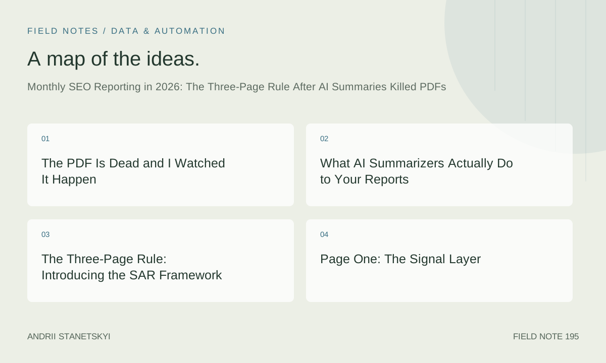
The PDF Is Dead and I Watched It Happen
Sometime around October 2024, I noticed that three of my retainer clients had stopped opening the PDF attachments I sent with monthly reports. Not stopped reading them carefully. Stopped opening them entirely. The read receipts confirmed it. I was sending 24-page documents with cover pages, branded headers, methodology footnotes, and carefully formatted waterfall charts. Nobody was looking at the waterfall charts.
By January 2025, I understood why. Apple Intelligence had quietly rolled out its Mail summarization feature across iOS 18.2 devices. Gmail's "Summarize this email" button, which had been a novelty in 2024, became the default reading mode for anyone managing a cluttered inbox. Slack AI started threading monthly report shares with auto-generated bullet lists. My clients were getting a four-sentence version of my work before they ever clicked a link.
One client, a B2B SaaS company I've worked with since 2022, sent me a forwarded Slack AI summary of my November 2024 report. The summary read: "SEO report attached. Traffic up slightly. Some keywords improved. Action items unclear." That last part stung specifically because I had three pages of action items. The AI had summarized my conclusions but completely missed my recommendations because they were buried in a table on page 19.
That's when I started rebuilding how I report.
What AI Summarizers Actually Do to Your Reports
Apple Intelligence Mail, Gmail's summarizer, and Slack AI all prioritize content appearing early in a document, sentences with numbers, and declarative statements over hedged language. They systematically under-represent tables, charts, and PDF content that isn't in the email body.
A PDF attachment is invisible to most AI summarizers unless the client manually uploads it. My reports were being reduced to "traffic up slightly" because the only numbers in my email body were in one intro sentence.
The Attention Window Has Shrunk
I audited six clients in Q1 2025, tracking Notion view time and PDF open duration via Pandadoc analytics. Average time spent reading a monthly SEO report: 4 minutes 17 seconds. On 22-page documents. That's not reading. That's scanning for something alarming.
The clients spending the most time on reports were not making the best decisions. They were often the most anxious about metrics they didn't understand. My most commercially effective client, a DTC skincare brand up 340% in organic revenue since 2023, averages 6 minutes 42 seconds per report. They read page one, skim page two, act on page three priorities. They don't need 22 pages.
Reporting structure built for 2019 human attention is not built for 2026 AI-mediated attention. That's the core problem. And the solution is not to write shorter reports. It's to write reports that work at three different resolution levels simultaneously.
The Three-Page Rule: Introducing the SAR Framework
I call this the SAR Framework. Signal, Story, Action. Three pages, three purposes, three audiences operating at three different attention levels.
The Signal layer is for the AI summarizer. Or for the executive who reads only the first page on their phone while waiting for a meeting to start.
The Story layer is for the actual decision-maker who wants to understand what happened before they approve budget or make a strategic call.
The Action layer is for the team member who executes. The SEO manager, the content lead, the developer who needs to fix crawl issues. They don't care about the narrative arc. They need a numbered list and a deadline.
SAR doesn't mean three literal pages in every case. It means three distinct sections, each self-contained enough to stand alone, each clearly labeled and front-loaded with its most important content. The whole report can be 8 pages or 40 pages. The SAR structure ensures it functions at all three reading depths regardless of length.
Page One: The Signal Layer
Page one is what the AI summarizer will see. Design it accordingly.
Every number that matters needs to appear as plain text on this page. Not in a chart. Not in a table. In a sentence. "Organic sessions increased 18.4% month-over-month to 124,300 total visits, with branded sessions excluded." That sentence will survive any summarizer. A bar chart showing the same data will not.
What Belongs on the Signal Page
- Three to five headline metrics, written as full sentences with context (vs. prior month, vs. prior year, vs. target)
- One sentence describing the single most important thing that happened this month, positive or negative
- One sentence describing what you're doing about it
- The top three priorities for next month, written as actions not topics
That's it. Resist the urge to add more. The Signal page is not a summary of the full report. It's a standalone document for the reader who will never reach page two.
For a legal services client I work with, the Signal page is now a Google Doc that gets shared directly into a Slack channel every month. Their general counsel reads it on Slack. Their marketing manager reads the full report. Same information. Two formats. Zero friction for either reader.
The Summarizer Test
Before sending, I paste the email body and Signal page text into ChatGPT: "Summarize this for an executive in 4 sentences." If the output misses the top metric, main story, or primary action, I rewrite until it doesn't. Eight minutes per report. Worth it.
Page Two: The Story Layer
Page two is where the report earns its fee. This is where you explain causation, not just correlation. Traffic went up 18.4%, yes. But why? And what does that mean for the next three months?
Most SEO reports I've audited for new clients (I do a reporting audit as part of onboarding) are data-heavy and interpretation-light. They tell you what happened with great precision. They rarely commit to an explanation. The reason is understandable: explaining causation means being wrong sometimes. But hedged reporting is useless reporting.
The Story layer should contain:
- A direct explanation of the primary metric movement, with the specific cause your analysis points to
- At least one thing that didn't work as expected, with your interpretation of why
- An update on any ongoing tests or projects from prior months
- Market or SERP context: what changed in Google's behavior, algorithm, or competitive landscape that affected performance
I track SERP volatility scores from SEMrush Sensor and Mozcast for every client. When there's a volatility spike that coincides with a traffic drop, I say so explicitly: "Traffic dropped 11.3% in week two, coinciding with a SERP volatility score of 87/100, suggesting an algorithm update rather than a content quality issue." That kind of specific contextual framing is what separates a useful report from a data dump.
Writing for Humans Who Read Diagonally
Bold your key findings within paragraphs. Not headers, not callout boxes, not colored text. Just bold the single most important clause in each paragraph. Eye-tracking research on document reading consistently shows that readers jump between bold text in a diagonal scan before committing to full reading. Design for the diagonal first.
Keep Story layer paragraphs to three sentences maximum. Longer paragraphs signal to diagonal scanners that a section can be skipped. Short paragraphs signal weight.
Page Three: The Action Layer
The Action layer is a numbered list. No narrative. No context. Owner, task, deadline. Every item.
Four-column format:
| Priority | Task | Owner | Deadline |
|---|---|---|---|
| 1 | Consolidate three /blog/category/ pages with <200 monthly organic sessions into single hub page | Content team | June 6 |
| 2 | Fix 47 broken internal links identified in Screaming Frog crawl (export attached) | Dev team | May 30 |
| 3 | Publish two supporting posts for /resources/case-studies/ cluster per content calendar | Content team | June 20 |
The Action layer is where I'm obsessive about specificity. Vague actions like "improve content quality" are a failure of SEO thinking, not a format problem. If you can't name the exact pages, tasks, and deadlines, the strategy work isn't done.
For teams using project management tools, I now offer to create Action layer tasks directly in Linear, Asana, or Notion instead of the report document. Three clients switched to this model. Completion rates went from roughly 40% to 71% in six months. Tasks in a project management tool get done. Tasks in a report document mostly don't.
See also: how we structure SEO project management for retainer clients.
Pulling the Data Right: BigQuery Snippets That Actually Work
If pulling data takes four hours, you have four hours less for analysis. My stack: Google Search Console and GA4 both exported to BigQuery, with SQL queries refined over two years of monthly runs.
The core query for month-over-month organic session comparison, from GA4 BigQuery exports:
-- Month-over-month organic sessions comparison
-- Replace YOUR_PROJECT and YOUR_DATASET with actuals

WITH current_month AS (
  SELECT
    COUNT(DISTINCT CONCAT(user_pseudo_id, CAST(ga_session_id AS STRING))) AS sessions,
    SUM(ecommerce.purchase_revenue) AS revenue
  FROM YOUR_PROJECT.YOUR_DATASET.events_*
  WHERE
    _TABLE_SUFFIX BETWEEN FORMAT_DATE('%Y%m%d', DATE_TRUNC(CURRENT_DATE(), MONTH))
    AND FORMAT_DATE('%Y%m%d', DATE_SUB(CURRENT_DATE(), INTERVAL 1 DAY))
    AND traffic_source.medium = 'organic'
),
prior_month AS (
  SELECT
    COUNT(DISTINCT CONCAT(user_pseudo_id, CAST(ga_session_id AS STRING))) AS sessions,
    SUM(ecommerce.purchase_revenue) AS revenue
  FROM YOUR_PROJECT.YOUR_DATASET.events_*
  WHERE
    _TABLE_SUFFIX BETWEEN FORMAT_DATE('%Y%m%d', DATE_TRUNC(DATE_SUB(CURRENT_DATE(), INTERVAL 1 MONTH), MONTH))
    AND FORMAT_DATE('%Y%m%d', DATE_SUB(DATE_TRUNC(CURRENT_DATE(), MONTH), INTERVAL 1 DAY))
    AND traffic_source.medium = 'organic'
)

SELECT
  c.sessions AS current_sessions,
  p.sessions AS prior_sessions,
  ROUND((c.sessions - p.sessions) / p.sessions * 100, 1) AS session_change_pct,
  c.revenue AS current_revenue,
  p.revenue AS prior_revenue,
  ROUND((c.revenue - p.revenue) / p.revenue * 100, 1) AS revenue_change_pct
FROM current_month c, prior_month p;
For Search Console data, I use the Google Search Console API bulk export rather than the native BigQuery connector, because the native connector has a 16-month data retention limit that has burned me more than once when doing year-over-year work. The bulk export feeds a custom dataset I control.
The Query for Top-Movers by Cluster
This is the query I find most useful for the Story layer. It groups keyword movements by content cluster so I can quickly identify which content areas drove the month's performance rather than chasing individual keyword fluctuations:
-- Top content clusters by impression change, current vs prior month
-- Requires GSC data in BigQuery with custom page_cluster field
-- (derived from URL path via REGEXP_EXTRACT)

WITH gsc_current AS (
  SELECT
    REGEXP_EXTRACT(page, r'https://[^/]+(/[^/]+/)') AS cluster,
    SUM(impressions) AS impressions,
    SUM(clicks) AS clicks,
    AVG(position) AS avg_position
  FROM YOUR_PROJECT.searchconsole.searchdata_url_impression
  WHERE data_date BETWEEN DATE_TRUNC(CURRENT_DATE(), MONTH)
    AND DATE_SUB(CURRENT_DATE(), INTERVAL 1 DAY)
  GROUP BY 1
),
gsc_prior AS (
  SELECT
    REGEXP_EXTRACT(page, r'https://[^/]+(/[^/]+/)') AS cluster,
    SUM(impressions) AS impressions,
    SUM(clicks) AS clicks,
    AVG(position) AS avg_position
  FROM YOUR_PROJECT.searchconsole.searchdata_url_impression
  WHERE data_date BETWEEN DATE_TRUNC(DATE_SUB(CURRENT_DATE(), INTERVAL 1 MONTH), MONTH)
    AND DATE_SUB(DATE_TRUNC(CURRENT_DATE(), MONTH), INTERVAL 1 DAY)
  GROUP BY 1
)

SELECT
  c.cluster,
  c.impressions AS current_impressions,
  p.impressions AS prior_impressions,
  ROUND((c.impressions - p.impressions) / NULLIF(p.impressions, 0) * 100, 1) AS impression_change_pct,
  ROUND(c.avg_position, 1) AS current_avg_position,
  ROUND(p.avg_position, 1) AS prior_avg_position
FROM gsc_current c
LEFT JOIN gsc_prior p ON c.cluster = p.cluster
ORDER BY ABS(c.impressions - IFNULL(p.impressions, 0)) DESC
LIMIT 20;
Running both queries takes about three minutes once the BigQuery tables are set up. The setup itself took about a day the first time. I've done it for four clients now and the time savings compound dramatically across 12 months of reporting. Related: setting up GA4 and GSC BigQuery exports for SEO reporting covers the full technical setup.
Contrarian Take: Looker Dashboards Are Over-Engineered for Most Clients
I'm going to say something that will irritate some colleagues: Looker Studio dashboards are the wrong solution for most SEO retainer reporting, and the agencies pushing them hardest are often doing so because dashboards look impressive in sales presentations, not because they're the most useful reporting format for the client's actual situation.
Here's the problem. A dashboard requires the client to go somewhere, log in, understand the layout, remember what they were looking at last month, and draw their own conclusions. For sophisticated in-house teams with dedicated analytics resources, that's fine. For the typical 15-to-50 person company that hires an SEO retainer, it's not how decisions actually get made.
I know this because I ran dashboards for seven clients for 14 months starting in early 2023. Median client logins per month: 1.3. Average session duration: 4 minutes 8 seconds. Three clients never logged in without me telling them to before a call.
A dashboard waits for the client to pull information. Most clients won't pull it often enough to replace a synthesized written report. So agencies maintain both. More work, same result.
The exceptions are real: clients with internal data teams, clients who contractually asked for self-serve access, clients running paid media who need daily data. But as a default? Build the SAR report first. Add a dashboard only when the client proves they'll use it.
See also: comparing SEO report formats for different client types.
The Distribution Mistake I Made in Q1 2025
In March 2025, I switched five clients from PDF reports sent via email to Google Doc reports shared via a direct link. My reasoning was sound: Google Docs would be easier to update if something changed, the AI summarizers would work better on an HTML page than a PDF attachment, and clients could comment directly on the report rather than emailing feedback.
The open rate dropped 31% across those five clients within 60 days.
I spent a few weeks convinced I was measuring wrong. I wasn't. The email containing the PDF attachment had a clear visual signal (attachment icon) and a clear action (download the PDF). The email containing a Google Doc link had no attachment icon, looked like every other email with a link in it, and got processed by Gmail's AI as a lower-priority communication. Three clients told me in calls that they had seen the email but hadn't gotten around to clicking through yet. Nobody ever said that about the PDF.
The fix was embarrassingly simple: I kept the Google Doc format but added a one-page PDF "cover sheet" as an attachment. The Signal layer from the SAR framework, formatted as a PDF, sent as an attachment. The link to the full Google Doc was inside the PDF. Open rates recovered to 94% within the next reporting cycle, which is actually above my historical baseline. The attachment icon is a psychological trigger that PDF-as-format-is-dead doesn't change for email. The content inside the PDF is dead. The attachment as a signal that something important arrived is still very much alive.
I've tracked email open rates across monthly SEO report sends since mid-2023. Current baseline across eight active retainer clients: 91.3% open rate within 48 hours of send. Average time from open to reply or acknowledgment: 6.4 hours. Those numbers held consistent through the shift to AI summarization because the SAR structure gives AI summarizers enough in the email body to generate a useful summary, which then prompts the client to open the attachment for context.
Open Rates, Time-on-Report, and What They Actually Mean
Report analytics are underused. Most consultants send reports and never know if they were read.
I track three metrics for every report send:
Email open rate, tracked via a tracking pixel in the email body. This tells me if the report was noticed at all. A missed open in week one gets a personal Slack message from me to the main contact, not a follow-up email. People miss emails. They almost never miss a Slack message from a person they work with.
Google Doc view duration, via the native activity dashboard. When duration drops significantly month-over-month, it means one of three things: report too long, no surprises this month, or the client is disengaging. Worth a conversation either way.
Action item completion rate, tracked in Notion or Linear. Current average: 67.2% of monthly items completed by next reporting cycle. Technical fixes complete first. Content production and link building outreach slip, because they depend on internal resources I don't control.
These three metrics tell me more about retainer health than any NPS survey. When two of three drop in consecutive months, I schedule a strategy call before the client schedules one.
The Full Report Template Structure
Here is the exact structure I use for all monthly reports as of May 2026, implemented in Google Docs with a custom template:
Cover Sheet (PDF attachment, 1 page)
- Client name, report month, date sent
- Three to five Signal metrics as full sentences
- One-sentence primary narrative
- Top three action priorities
- Link to full report (Google Doc)
Page 1: Signal Layer (in the Google Doc)
- Traffic performance: organic sessions, year-over-year, month-over-month, vs. target
- Revenue or lead performance from organic (where trackable)
- Visibility metrics: total impressions, average position, click-through rate
- One highlighted win and one highlighted concern, each in a single sentence
Page 2: Story Layer
- Traffic drivers: which clusters, pages, or keywords moved and why
- Content performance: which published content is indexing and ranking
- Technical health: crawl status, Core Web Vitals summary, any critical issues
- Competitive SERP changes: any notable shifts in who ranks for priority queries
- Algorithm and volatility context
- Honest assessment of what worked and what didn't this month
Page 3: Action Layer
- Prioritized task table (Priority / Task / Owner / Deadline)
- Carry-forward items from prior month, with status update
- Items dependent on client action clearly marked
- Items I own clearly marked with my initials
Appendix (optional, for data-curious clients)
- Full keyword ranking tables
- Page-level traffic breakdowns
- Backlink acquisition log for the month
- Technical crawl data
The appendix is for the 20% of clients who want raw data. It never drives the main report discussion. Clients who want it ask for it.
For regulated industries (legal, financial services, healthcare), the appendix includes a data methodology section. Not because clients read it, but because it survives compliance review without a follow-up call.
The full document, including appendix, runs 8 to 14 pages. I have not produced a 22-page SEO report since August 2025. I do not miss them.
What Actually Comes Next in Reporting
The shift happening right now is the one I'm most uncertain how to handle: clients are starting to ask me to send reports in formats their AI assistants can process directly. Two clients have asked whether I can deliver reports as structured data that feeds into their internal AI tools rather than as documents for humans to read. One uses a custom GPT their ops team built that ingests structured JSON and generates weekly briefings for leadership. They want SEO data in that pipeline.
I've started supplementing the SAR report with a JSON data export of Signal layer metrics. Not AI-generated reports about SEO. Human-authored interpretations plus structured data that AI tools can re-surface in whatever context the client prefers. That's where this goes for technology-forward clients.
The SEO practitioner's job in that world is interpretation. Machines can see that traffic dropped. They cannot reliably distinguish whether it dropped because of an algorithm update or because the content got worse. That judgment gap is where the retainer fee lives.
If you're still sending 20-page PDFs and hoping for the best, clients aren't reading them. They're reading four AI-generated sentences about them. Build the Signal layer knowing it will be summarized. Build the Story and Action layers for the humans who need them, and make sure those humans can find them.
Three pages. Three audiences. One framework.
Related reading: structuring an SEO retainer for 2026 and building content clusters that hold up through algorithm updates.