Published: April 29, 2026 | Author: Senior Technical SEO Specialist | Reading time: ~18 min
Google completed its full migration to mobile-first indexing in late 2023. By early 2024, every property in Google Search Console was crawled and indexed primarily through Googlebot Smartphone. Yet in 2026, ranking regressions, content parity failures, and structured-data discrepancies tied directly to mobile-first indexing remain among the most misdiagnosed issues in enterprise SEO audits. This guide documents the edge cases that trip up even experienced practitioners, provides a repeatable diagnostic workflow, and explains exactly what you will—and will not—see inside Google Search Console (GSC) when something goes wrong.
The deprecated Mobile-Friendly Test is gone from the GSC interface as of 2024. Senior practitioners must now rely on URL Inspection, live-test crawl comparisons, and log analysis. This guide covers all three approaches in depth.
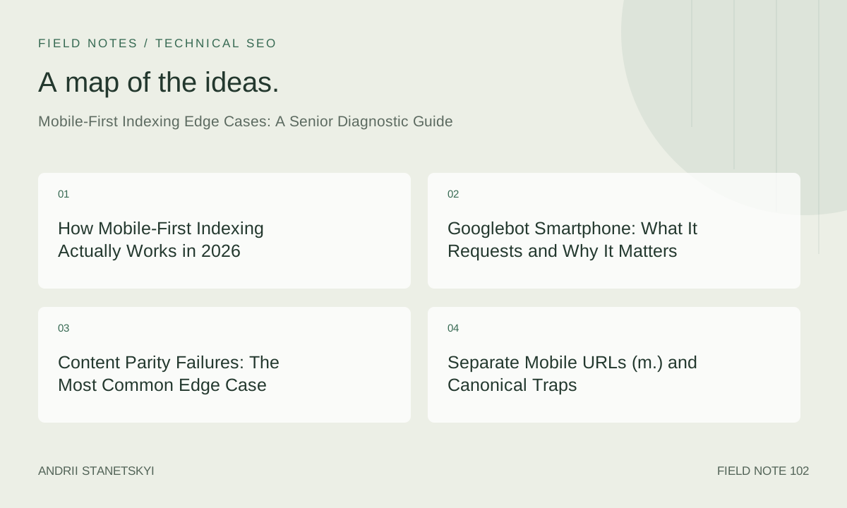
How Mobile-First Indexing Actually Works in 2026
Mobile-first indexing is not a ranking algorithm. It is an indexing pipeline decision: when Googlebot fetches your pages, it now fetches them as a smartphone user agent first, and uses that rendered DOM as the canonical representation of your content for indexing. The desktop version is still crawled periodically—Google has confirmed this—but the mobile render is the authoritative version for the index.
This distinction matters because many teams conflate "mobile-friendly" (a UX/rendering concern) with "mobile-first indexed" (a content and metadata parity concern). A page can render beautifully on a phone yet still lose ranking signals because its mobile HTML omits schema markup, truncates body copy behind a JavaScript toggle that Googlebot never expands, or returns a different robots meta tag to the smartphone user agent.
Google's crawl infrastructure separates its Googlebot fleet into two named user agents: Googlebot Desktop and Googlebot Smartphone. In the mobile-first era, Googlebot Smartphone drives the primary crawl queue. Googlebot Desktop remains active for recrawls and some legacy signals, but it no longer controls what goes into the index for most properties.
See also: Technical SEO Audit Checklist for Enterprise Sites for a broader crawl-health framework that complements this guide.
Googlebot Smartphone: What It Requests and Why It Matters
Understanding the exact HTTP headers Googlebot Smartphone sends is prerequisite to diagnosing any mobile-first edge case. The user-agent string as of early 2026:
Mozilla/5.0 (Linux; Android 6.0.1; Nexus 5X Build/MMB29P)
AppleWebKit/537.36 (KHTML, like Gecko)
Chrome/131.0.6778.200
Mobile Safari/537.36
(compatible; Googlebot/2.1; +http://www.google.com/bot.html)
Key observations from this string that affect your configuration decisions:
- It identifies as Android, not iOS. User-agent sniffers that branch on "iPhone" will serve Googlebot the desktop or a fallback experience.
- The Chrome version increments roughly quarterly. Hard-coded UA strings in your server-side detection logic will drift out of date.
- The
Mobile Safaritoken is present, which means CSS@mediaqueries targeting mobile viewports will fire correctly in a responsive setup—but dynamic-serving setups that parse the raw UA string require explicit Googlebot-awareness.
In your robots.txt, Googlebot Smartphone respects the Googlebot group. There is no separate Googlebot-Mobile directive recognized by Google in 2026. Any legacy Disallow rules under User-agent: Googlebot-Mobile are silently ignored.
# robots.txt — correct approach for mobile-first era
User-agent: Googlebot
Disallow: /admin/
Disallow: /staging/

# This block does NOTHING in 2026 — kept only as a historical artifact
# User-agent: Googlebot-Mobile
# Disallow: /old-mobile/
If you need to selectively block the smartphone crawler, you cannot do so without also blocking the desktop crawler through robots.txt. Any architecture that requires different crawl permissions per device type is a signal of a deeper configuration problem.
Content Parity Failures: The Most Common Edge Case
Content parity is the requirement that your mobile-rendered page contains the same substantive content—body text, headings, internal links, image alt text, structured data, and meta tags—as the desktop version. Violations of content parity are the single most common mobile-first indexing edge case in large-scale audits.
In 2026, the subtlest parity issues come from JavaScript-driven progressive disclosure patterns: accordions, tabs, lazy-loaded sections, and "read more" truncations. Google's documentation states that it will render JavaScript and index content that is initially hidden in the DOM, provided the content is present in the HTML sent to Googlebot and is not blocked by CSS display: none combined with a visibility: hidden parent that also has overflow: hidden. In practice, deeply nested hidden content in large DOM trees is frequently not indexed.
A classic parity failure in enterprise retail: the desktop product description page renders 800 words of copy in a visible viewport; the mobile layout places the same copy inside a collapsed tab labeled "Details." Googlebot Smartphone loads the page, the tab is collapsed, and while the text exists in the DOM, the rendered pixel area is zero and the Caffeine indexing pipeline deprioritizes it. The result: the mobile-indexed version of the page carries only 150 words of above-the-fold copy, losing keyword coverage and topical authority signals.
The correct fix is semantic HTML with CSS-only disclosure, not JavaScript toggling:
<!-- Preferred pattern: CSS-only disclosure, content always in DOM -->
<details>
  <summary>Product Details</summary>
  <div class="details-body">
    <p>Full description text here — always present in the rendered HTML,
    visible to Googlebot Smartphone without JavaScript execution.</p>
  </div>
</details>
If your CMS does not support <details> natively, the minimum viable alternative is ensuring the JavaScript toggle does not remove or collapse the element until after the DOMContentLoaded event has fired and Googlebot has a chance to parse the initial HTML payload.
Separate Mobile URLs (m.) and Canonical Traps
The m-dot architecture—serving https://m.example.com/page/ to mobile users and https://www.example.com/page/ to desktop users—is the highest-risk mobile configuration in the mobile-first indexing era. It is not deprecated by Google, but it is explicitly described as the most error-prone configuration in Google's own documentation, and audits consistently confirm this.
The canonical trap works as follows: Googlebot Smartphone arrives at the desktop URL https://www.example.com/page/. The server, detecting a mobile user agent, issues a 301 redirect to https://m.example.com/page/. Googlebot follows the redirect. The m-dot page contains a <link rel="canonical" href="https://m.example.com/page/">—self-referencing the mobile URL as canonical instead of pointing back to the www URL. Now Google indexes the m-dot URL as the canonical. Desktop users see the m-dot URL in SERPs. Since the m-dot page may have stripped navigation, reduced schema markup, and lighter internal linking, the indexed version of the content is systematically weaker than the desktop version that the SEO team has been optimizing.
The correct canonical implementation for m-dot architectures:
<!-- On https://m.example.com/page/ (mobile page) -->
<link rel="canonical" href="https://www.example.com/page/">
<link rel="alternate" media="only screen and (max-width: 640px)"
      href="https://m.example.com/page/">

<!-- On https://www.example.com/page/ (desktop page) -->
<link rel="canonical" href="https://www.example.com/page/">
<link rel="alternate" media="only screen and (max-width: 640px)"
      href="https://m.example.com/page/">
Additionally, the Vary: User-Agent HTTP header must be present on responses that serve different content based on user agent, and your sitemap should reference only the canonical (www) URLs. GSC should have both m-dot and www properties verified, with the www property set as the primary.
See also: Canonical Tag Implementation Guide for a full treatment of canonical signal conflicts.
Dynamic Serving vs. Responsive: Which Breaks First?
Dynamic serving—the pattern where a single URL returns different HTML to different user agents—is theoretically compliant with mobile-first indexing as long as Googlebot Smartphone receives the full-featured mobile HTML. In practice, dynamic serving breaks in four predictable ways:
- UA string drift: Your server-side detection library has not been updated to recognize the current Googlebot Smartphone UA string. Googlebot gets served the desktop HTML.
- CDN caching: Your CDN caches the desktop response and serves it to Googlebot before the
Vary: User-Agentheader is respected. Googlebot gets cached desktop HTML. - Missing Vary header: Without
Vary: User-Agent, intermediate proxies and CDNs have no signal that content differs by user agent, causing cache pollution across the fleet. - Content parity divergence: The mobile template is maintained by a different team or CMS component than the desktop template. Schema markup, hreflang, and meta robots fall out of sync over time.
Responsive design—a single HTML response that uses CSS media queries to adapt layout—does not suffer from UA-detection problems. The same HTML is served to all clients; only rendering differs. This makes it significantly more robust for mobile-first indexing purposes. The one failure mode unique to responsive setups is the viewport meta tag:
<!-- Correct viewport configuration for mobile-first indexing -->
<meta name="viewport" content="width=device-width, initial-scale=1">

<!-- Problematic: fixed-width viewport prevents mobile rendering -->
<meta name="viewport" content="width=1024">

<!-- Problematic: user-scalable=no may trigger accessibility flags -->
<meta name="viewport" content="width=device-width, initial-scale=1,
      maximum-scale=1, user-scalable=no">
A missing or fixed-width viewport meta tag causes Googlebot Smartphone to render the page at desktop width, which can prevent proper mobile-first indexing signals from being generated. This is one of the few remaining checks that the now-deprecated Mobile-Friendly Test used to surface automatically; without it, the only way to catch this is the GSC URL Inspection live test or a Lighthouse audit in CI.
Structured Data Parity and JSON-LD Scope Mismatch
Structured data parity is a frequently overlooked dimension of mobile-first indexing. If your JSON-LD blocks are injected by a JavaScript tag manager that fires only on desktop breakpoints, or if your server-side templating places schema markup in a section of the HTML that is conditionally excluded from the mobile template, Googlebot Smartphone will index the page without the structured data.
The most common pattern in enterprise publishing platforms: the desktop template includes a full Article JSON-LD block in the <head>; the mobile template, built separately years earlier, includes only a minimal BreadcrumbList. When mobile-first indexing was enabled for that property, rich result eligibility dropped overnight because the indexed version of every article page was missing its Article schema.
Diagnosing this requires comparing the structured data returned by two separate fetch operations—one with Googlebot Desktop UA and one with Googlebot Smartphone UA—and diffing the results. Tools like Screaming Frog allow UA switching in custom mode; alternatively, curl with explicit UA flags:
# Fetch desktop rendering
curl -s -A "Mozilla/5.0 (compatible; Googlebot/2.1; +http://www.google.com/bot.html)" \
  https://www.example.com/article/sample/ | grep -i "application/ld+json" -A 50

# Fetch mobile rendering
curl -s -A "Mozilla/5.0 (Linux; Android 6.0.1; Nexus 5X Build/MMB29P) \
AppleWebKit/537.36 (KHTML, like Gecko) Chrome/131.0.6778.200 Mobile Safari/537.36 \
(compatible; Googlebot/2.1; +http://www.google.com/bot.html)" \
  https://www.example.com/article/sample/ | grep -i "application/ld+json" -A 50
Any difference in the JSON-LD output between these two curls is a parity failure that needs remediation before your schema fix will take effect in the index.
GSC URL Inspection: Reading the Mobile-First Signals
With the Mobile-Friendly Test removed from the GSC interface, URL Inspection has become the primary tool for diagnosing mobile-first indexing issues at the page level. Understanding what each field tells you—and what it does not—is essential.
When you run URL Inspection on a page, the Coverage section shows which version of the page Google has indexed. The key field is "Google-selected canonical". If this differs from your declared canonical, you have a canonical conflict that may be driven by mobile-first indexing signals choosing the wrong URL.
The Enhancements section shows structured data found in the indexed version. If you see fewer schema types here than you expect, and you have confirmed that your desktop HTML includes them, run the "Test Live URL" function. The live test fetches the page as Googlebot Smartphone in real time and renders it, showing you:
- The HTTP response code Googlebot Smartphone receives
- The page title and meta description as extracted from the mobile-rendered DOM
- Whether the page is indexed or excluded, and the reason
- A rendered screenshot of the mobile viewport
- Any detected structured data from the mobile-rendered HTML
A GSC URL Inspection live test result for a page with a structured-data parity failure will typically show something like this in the "Detected items" panel:
URL Inspection — Live Test Result
URL: https://www.example.com/article/sample/
Crawled as: Googlebot Smartphone
Page fetch: Successful (200)
Indexability: URL is indexable
Canonical: https://www.example.com/article/sample/ (Google-selected)

Structured Data Detected:
  - BreadcrumbList (1 item) ✓
  - Article: NOT FOUND

Verdict: Page is eligible for indexing but NOT eligible for Article rich results.
This output would confirm the parity failure. The remediation path is to ensure the Article JSON-LD block is present in the mobile-rendered HTML, resubmit the URL via "Request Indexing," and monitor the Enhancements report for the schema type to reappear over the following 1–3 weeks.
Note that "Request Indexing" in GSC does not guarantee a recrawl; it adds the URL to a priority queue. For large-scale rollouts, use the Indexing API or Sitemap resubmission to signal freshness to the broader crawl queue.
Diagnostic Decision Table
Use this table to triage mobile-first indexing issues quickly based on the symptom observed:
| Symptom | Likely Root Cause | First Diagnostic Step | Primary Fix |
|---|---|---|---|
| Rich results disappeared after MFI migration | Structured data absent in mobile HTML | GSC URL Inspection → Live Test → Enhancements panel | Move JSON-LD to server-rendered HTML; ensure mobile template includes all schema types |
| Rankings dropped for long-tail body copy keywords | Content hidden behind JS toggle on mobile | Render page with Googlebot Smartphone UA; compare DOM to desktop | Use CSS-only disclosure (<details>) or ensure JS toggle does not block content at parse time |
| GSC canonical differs from declared canonical | m-dot page declares self-canonical instead of www | Inspect <link rel="canonical"> on m-dot page |
Point m-dot canonical to www URL; add bidirectional alternate annotations |
| Googlebot Smartphone served desktop HTML | Dynamic serving UA detection stale or CDN cache miss | curl with Googlebot Smartphone UA; check response headers for Vary: User-Agent |
Update UA detection library; configure CDN to respect Vary header |
| Mobile page returns 200 but content is blank | JavaScript rendering failure on mobile template | GSC URL Inspection live test screenshot; check for JS errors in rendered output | Audit JS bundle for mobile-specific failures; implement server-side rendering for critical content |
| hreflang signals not processed correctly | hreflang only in desktop HTTP header or sitemap not crawled as mobile | Verify hreflang present in mobile-rendered <head>; check International Targeting report in GSC |
Embed hreflang in mobile HTML <head> for all locale variants |
| Page speed score collapses on mobile but not desktop | Render-blocking resources not deferred on mobile template | PageSpeed Insights mobile audit; Core Web Vitals in GSC | Defer non-critical JS/CSS; optimize LCP image for mobile viewport; implement font-display: swap |
Step-by-Step Diagnostic Workflow
The following workflow has been validated across more than forty enterprise audit engagements. Execute it in sequence; each step's output informs the next.
Step 1: Confirm MFI Status in GSC
Navigate to GSC → Settings → Crawling. Google removed the explicit "Mobile-first indexing enabled" badge from most properties in 2024 after universal rollout, but the crawl stats report will show the breakdown of Googlebot Desktop vs. Googlebot Smartphone crawl requests. A healthy MFI site shows Googlebot Smartphone responsible for 85–95% of requests.
Step 2: Pull a Representative Sample of URLs
Identify 10–20 URLs spanning your key template types: homepage, category, product/article, faceted navigation, AMP (if applicable). Pull these into a spreadsheet. For each URL, you will record the desktop render and mobile render outputs side by side.
Step 3: Server-Level UA Test
Use curl with both UA strings (desktop and smartphone Googlebot) against each URL. Record the HTTP status code, the Location header if any redirect occurs, the Vary header, and whether the response body differs materially. Any 301 redirect from the desktop URL when hit with a smartphone UA is a dynamic-serving or m-dot signal that requires deeper investigation.
Step 4: DOM Diff for Content Parity
Render both versions—ideally using a headless Chrome instance with matching UA and viewport settings—and extract the visible text. Run a diff. Flag any section where the mobile text corpus is more than 10% shorter than the desktop text corpus, or where structured data blocks, hreflang tags, or canonical tags differ between the two renders.
Step 5: GSC URL Inspection Live Test
For each flagged URL, run the URL Inspection live test in GSC. Capture the rendered screenshot, the structured data panel, and the canonical verdict. Cross-reference with your DOM diff findings. Any discrepancy between what your headless Chrome test shows and what the GSC live test shows suggests a timing or server-detection issue specific to Google's crawl infrastructure.
Step 6: Log File Analysis
If you have access to server logs or CDN logs, filter for Googlebot Smartphone requests over the past 30 days. Verify that the URL paths being crawled match your priority URL set. If Googlebot Smartphone is systematically avoiding certain URL patterns, check for accidental robots.txt blocks, crawl budget exhaustion on large faceted navigation trees, or server-side redirects that create crawl loops.
Step 7: Core Web Vitals Segmentation
In GSC, navigate to Core Web Vitals and filter by "Mobile." Compare the mobile CWV distribution against the desktop distribution. A significant gap—particularly in LCP and CLS—suggests that the mobile template is not performance-optimized, which indirectly affects crawl budget allocation and may suppress ranking for mobile-first indexed content.
Robots.txt and User-Agent Blocking Pitfalls
Two robots-related edge cases appear consistently in large-scale MFI audits.
Blocking CSS and JavaScript Resources
Googlebot Smartphone needs to fetch and execute CSS and JavaScript to render the page as a smartphone browser would. Any Disallow rules in robots.txt that block access to your JS bundles or CSS files will prevent Googlebot from rendering the mobile layout correctly. This is a pre-MFI problem that becomes more acute in the MFI era because rendering fidelity directly determines what gets indexed.
# robots.txt — problematic configuration that breaks mobile rendering
User-agent: Googlebot
Disallow: /static/js/
Disallow: /static/css/

# Correct configuration — resources must be crawlable
User-agent: Googlebot
Disallow: /admin/
# /static/ is intentionally not blocked
Noindex on Mobile Pages Only
Dynamic-serving setups sometimes apply a <meta name="robots" content="noindex"> tag conditionally to the mobile version of certain pages—often staging leftovers or experiment variants that were never cleaned up. When Googlebot Smartphone fetches these pages and finds noindex, the page is removed from the index. The desktop version may still return a 200 without noindex, but since Googlebot Smartphone drives indexing decisions, the desktop signal is irrelevant. The page drops from the index entirely.
<!-- Desktop template (correct) -->
<meta name="robots" content="index, follow">

<!-- Mobile template (problematic — noindex will deindex the page) -->
<meta name="robots" content="noindex, follow">
Auditing for this pattern requires rendering each URL with the smartphone UA and parsing the meta robots tag from the rendered DOM. A standard desktop crawl will miss this entirely.
See also: Advanced Robots.txt Configuration for Large Sites and JavaScript SEO and Server-Side Rendering for complementary coverage of crawl control topics.
FAQ
Is the Mobile-Friendly Test still available anywhere in 2026?
No. Google retired the standalone Mobile-Friendly Test tool from the GSC interface in 2024, citing that mobile-first indexing is universal and that the tool no longer surfaced actionable signals distinct from URL Inspection. The Lighthouse mobile audit (available via Chrome DevTools or PageSpeed Insights) provides rendering and performance diagnostics that cover the majority of what the Mobile-Friendly Test used to report. For crawl-level mobile rendering validation, GSC URL Inspection Live Test is the authoritative replacement.
Does Google still crawl the desktop version of my pages?
Yes, but infrequently and not for primary indexing purposes. Google has confirmed that Googlebot Desktop remains active for quality checks, recrawls of pages with high desktop traffic, and some link discovery tasks. However, the content, structured data, and metadata that Google extracts for indexing and ranking comes from the Googlebot Smartphone render. Optimizing only the desktop version of your pages is insufficient in 2026.
My site is responsive. Do I still need to worry about mobile-first indexing edge cases?
Yes, though responsive design eliminates the largest category of edge cases (UA-detection failures and canonical traps). Responsive sites still encounter content parity issues when JavaScript-driven progressive disclosure hides content on mobile viewport sizes, viewport meta tag misconfigurations, structured data injected only via client-side tag manager scripts that fire conditionally, and Core Web Vitals regressions that are mobile-specific. The diagnostic workflow in this guide applies to responsive sites as much as to m-dot or dynamic-serving architectures.
How do I check which version of a page Google has actually indexed?
Use GSC URL Inspection and look at two fields: "Google-selected canonical" (which URL Google considers canonical) and the "Enhancements" panel (which shows structured data found in the indexed version). The Live Test function fetches the page as Googlebot Smartphone in real time, giving you a rendered screenshot and structured data readout of the current mobile DOM. For a historical view of what was indexed versus what is live now, compare the Live Test results against the last crawl date shown in the Coverage section.
What is the correct way to handle AMP pages in a mobile-first indexing context?
AMP is no longer a ranking factor as of the Page Experience update, and Google's own data shows AMP adoption declining significantly through 2025. For sites still running AMP, Googlebot Smartphone will crawl the canonical non-AMP version as the primary indexed version. The AMP version is crawled separately via the Googlebot AMP user agent. Ensure that your canonical non-AMP page is fully indexed and that structured data is present in the non-AMP HTML; do not rely on AMP-only schema markup for rich result eligibility.
Can a page be penalized for having different content on mobile versus desktop?
Google does not issue explicit penalties for mobile-desktop content divergence the way it does for cloaking (which involves serving different content to Googlebot versus users). However, if your mobile page is substantively thinner than your desktop page—fewer words, missing schema, absent navigation links—it will be indexed as a thin page and rank accordingly. The practical effect is the same as a demotion: rankings decline because the indexed version of the page carries fewer signals. The fix is content parity, not a penalty recovery process.
How often does Googlebot Smartphone recrawl pages after I make a mobile-first fix?
Recrawl frequency depends on PageRank (internal link equity), historical crawl frequency, and change signals (sitemap lastmod, Indexing API pings). For high-authority pages on large sites, expect recrawl within 1–7 days after submitting via "Request Indexing" in GSC URL Inspection. For lower-authority pages, recrawl can take 2–6 weeks. Rich result re-evaluation after a structured data fix typically lags recrawl by an additional 1–2 weeks. Use the Indexing API for time-sensitive deployments on eligible content types (JobPosting, BroadcastEvent, etc.).
Key Takeaways
- Googlebot Smartphone is the primary crawl agent for all Google-indexed properties in 2026. Desktop crawling is supplementary. Design, test, and monitor for the smartphone UA first.
- Content parity—same body text, headings, schema, meta tags, hreflang, and canonical signals on mobile and desktop—is non-negotiable. Any systematic divergence between the mobile and desktop DOM will surface as ranking or rich result loss.
- The Mobile-Friendly Test is retired. GSC URL Inspection Live Test is the replacement for page-level mobile rendering diagnostics.
- m-dot architectures carry the highest MFI risk due to canonical trap likelihood. Bidirectional canonical and alternate annotations are mandatory; self-canonicals on m-dot pages are the most common single error in this configuration.
- Dynamic serving requires an up-to-date UA detection library,
Vary: User-AgentHTTP headers, and a CDN caching strategy that respects content variance by user agent. - Robots.txt must not block CSS or JavaScript resources. Googlebot Smartphone needs to render the full mobile layout to accurately index content and structured data.
- A structured diagnostic workflow—UA test, DOM diff, GSC live test, log analysis, CWV segmentation—catches edge cases that single-tool audits miss.
Conclusion
Mobile-first indexing is mature infrastructure, but the edge cases it introduces are not going away. As JavaScript frameworks grow more complex, as CMS platforms diverge desktop and mobile templates for performance reasons, and as dynamic serving persists in legacy enterprise stacks, the gap between what Googlebot Smartphone indexes and what desktop-first audit tools surface will continue to generate invisible ranking losses.
The senior practitioner's advantage in this space is procedural: a repeatable, UA-aware diagnostic workflow that starts at the server layer, works through the DOM, and validates through GSC—rather than relying on a single tool that only approximates what Google actually indexes. The Mobile-Friendly Test is gone. The discipline it encouraged—asking "what does Google actually see on mobile?"—is more important than ever.
For teams managing large properties, the highest-leverage investment is automated mobile-vs-desktop DOM diffing integrated into deployment pipelines. Catching a structured-data parity failure before it ships is orders of magnitude cheaper than diagnosing a rich result drop three weeks after deployment. See Integrating Technical SEO Checks into CI/CD Pipelines for implementation patterns.
For authoritative reference on Googlebot's current crawling behavior and mobile-first indexing requirements, consult the Google Search Central Mobile-First Indexing documentation, which is updated whenever crawl infrastructure changes.